How to build a scalable data collection, aggregation, and analysis service for Mobile User Acquisition Managers

In this blog post I will outline the basics for why and how to build an in-house solution for accurately tracking and quickly analyzing the ROI of acquisition spend across any number of acquisition channels. All without wasting time in spreadsheets (which isn’t scalable) or paying monthly SaaS fees that many startups can’t afford. At the end I’ll even provide a basic demo version of what this system might look like for you to play with.
But first…How did we get here?
When I started marketing mobile apps for Smule back in 2008 the iPhone was only a year old, the AppStore had just been announced, there were no free apps, no subscriptions, no sharing economy, and Ocarina hit #1 on the charts with only a few thousand downloads a day.
In my 8 years at the company, I witnessed the birth and growth of the entire mobile UA industry. While my job was to run every kind of non-technical organic growth program imaginable (although my education was quite technical), I was fascinated by the constant insanity of the paid UA team (I sat right next to them) and how they seemed to be in desperate need of tools to help them wrangle the seemingly endless stream of acquisition platforms that were popping up daily, trying to get them to spend money while not having a robust way of scaling the measurement of acquisition costs. I left in 2016 at which point everyone on the UA team was a rockstar in the industry and they had developed an impressive method for managing the madness.
A year later (nearly a decade after the launch of the AppStore) I decided to try my hand at being a UA manager for a subscription based iOS/Android app called Sanity & Self. And thanks to what I learned through osmosis at Smule, I set out with a goal of building a scaleable and inexpensive way to monitor performance across all my channels right from the beginning.
Why build a tool like this?
SHORT ANSWER: Without a tool like this we’re stuck pulling reports and doing data manipulation and visualization in programs like excel…which is terribly inefficient and doesn’t scale at all, especially when you have a small UA team (Tableau is better but has some pitfalls and costs money). Or you have to consider spending big money on SaaS platforms that often do not have pricing tiers aimed at startups on a lean budget, and there’s something to be said for keeping your data in-house.
LONG ANSWER: Let’s start with a little Mobile UA 101 to gain an understanding of how a data pipeline is crucial to UA success, and how a tool like this can make our lives much easier and marketing spend more efficient.
Mobile User Acquisition 101
#Goals

The most basic ideal high level goal of user acquisition is pretty straightforward. Spend as much money as possible while acquiring the highest value customers at the lowest cost per acquisition.
In other words, maximize Return on Ad Spend (ROAS).
How do we achieve this goal?

In order to achieve our goal, we run ads across as many ad networks as possible (maximize the pool of eyeballs) and attempt to show the most effective ads to various high value audience segments on each network (capture the attention of qualified eyeballs)
The Acquisition Manager’s Dilemma
PROBLEM: There are essentially an infinite variety of factors that can cause changes in UA performance
Every ad network is unique in terms of the audiences they reach, when and where they display ads, how their algorithms work, and how many other advertisers are competing for the same eyeballs at any given time. On top of that, changes to our landing pages or the product itself can impact performance across all our channels.
SOLUTION: Monitor performance with indicator metrics to identify root causes and take action
In order to isolate problems, adapt, and optimize as things fluctuate we need a way to monitor performance. To do this, we must choose a small set of metrics to act as indicators of potential issues at each level of the user journey (aka funnel) and then visualize them so we can see when/where issues occur.
The Easy Part — Identifying our metrics
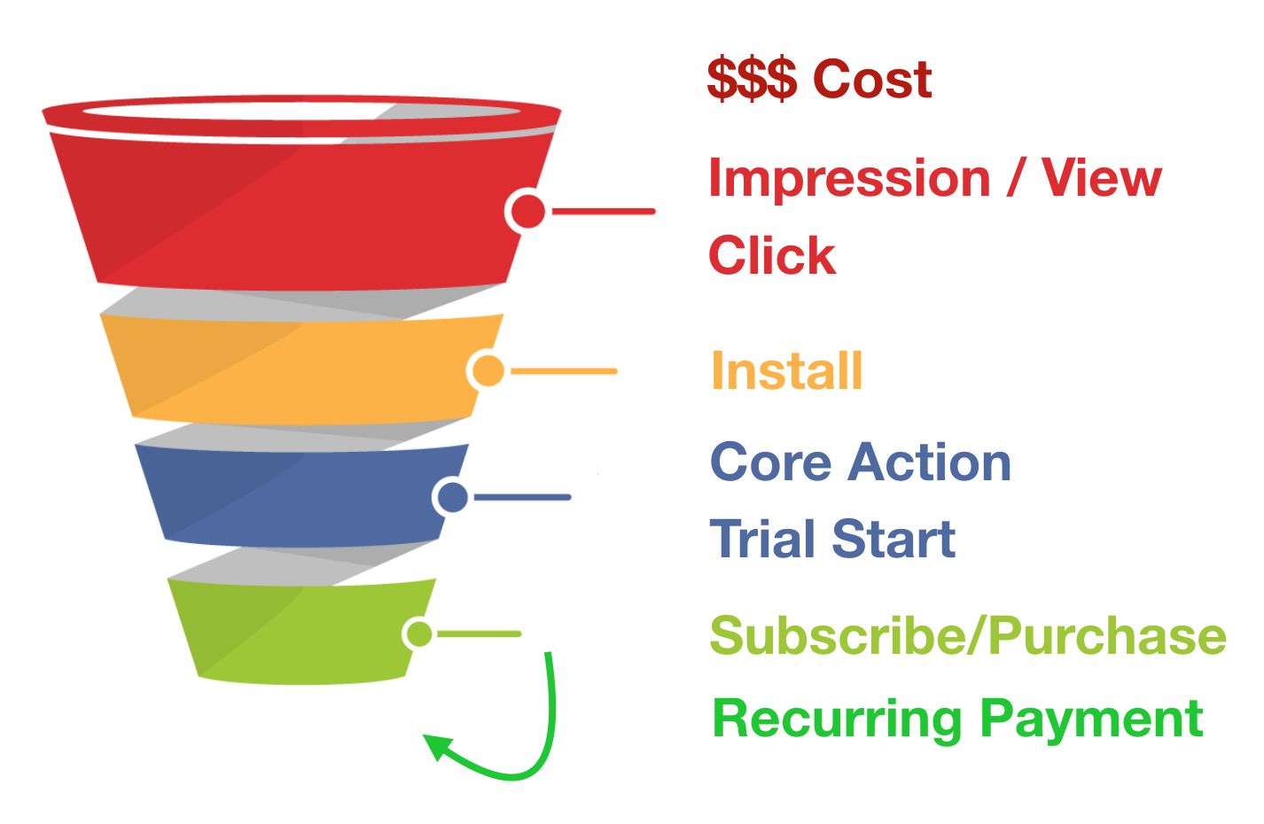
Looking at the raw data generated throughout the user journey / funnel we can identify the most important events across our various conversion points.
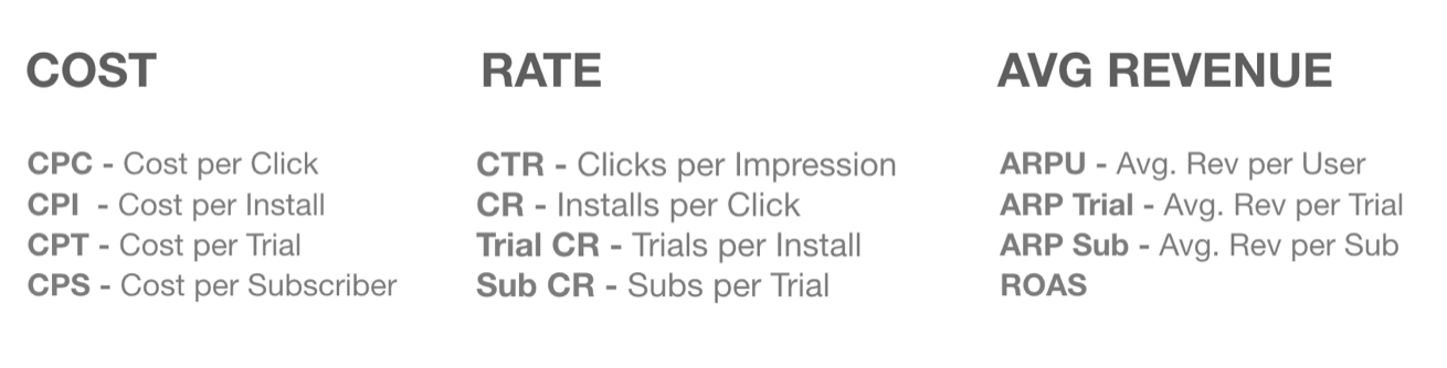
With this data we can calculate a few simple metrics for each conversion point: cost per conversion, rate of conversion, and average revenue per conversion.
Finally, with this set of metrics we can visualize the funnel in a simple yet comprehensive way that lets us identify where any performance issues are occurring and make an informed guess as to what the root cause may be…at least in theory.
The Hard Part — Data Accessibility and Uniformity
Everything up to this point is theoretical and therefore relatively straightforward. In practice though, there is one major problem that many SaaS companies are attempting to solve.

PROBLEM: The data from our funnel is spread across a variety of sources and it’s not uniformly formatted/labeled across them. Sounds simple but it’s a big deal and has a few pitfalls to look out for.
Top Funnel metrics like Cost, Impressions, Views, Clicks come from the advertising platforms (i.e. Facebook, Google, Snap, Pinterest, etc.)
Mid Funnel and attributed metrics like Installs, Sessions, Core Actions, Trial Starts, and maybe revenue events come from the obligatory MMP (Mobile Measurement Partner like Adjust or AppsFlyer)
Bottom Funnel metrics like recurring payments or other various revenue conversions might come from the payment processors or other internal BI tools.

SOLUTION: We need a tool that pulls all of the data from all of our sources across the entire funnel into one place, ensures it is uniformly labeled, and groups it by date, OS, and ad network at the least.
Ideally we can also drill down further and slice by campaign / ad-set / creative
Once all of our data is streamlined and in one place we can finally visualize it and gain truly actionable insights without the hassle of looking at a bunch of spreadsheets and with peace of mind that the data is correct.
How to build this
ETL - Data manipulation and versatility
The extraction method depends on the data source. Some data sources have an API, others only offer daily reports sent by e-mail as a CSV, while some require manual report generation. Regardless of the method, it’s pretty straightforward and fast. It can be further sped up by relatively inexpensive 3rd party integrations.
The transformation. This is the bulk of the work, but once written, it can be run once a day (or more if necessary) to keep the front-end up to date. The goal being to take all of the data sources that have been extracted, uniformly name their columns for the metrics we want to aggregate (Cost, Impressions, Clicks, Installs, Sessions, Core Actions, Trial Starts, Subscriptions/Purchases, etc.) and dimensions (Date , Platform (iOS/Android), Advertiser, Campaign, Ad-Set, etc.) and join them all together.
I wrote my transformation script in Python using the Pandas module. This has the benefit of being able to run in any container that supports Python. Of course if you’re manipulating data in a warehouse like Big Query you’re probably going to be stuck with SQL…for now.
Most importantly, this script should be written in a way that makes it trivial to add additional data sources or identify and correct errors when they occur. Because sometimes ad networks like to change the names of their columns!!!! WHYYYYY FACEBOOK WHYYYYYYY!!!!Loading is the last step of the the process. The final transformed DataFrame (or table…or database) should only contain the necessary information for the visualization it will be used for. This keeps it super lightweight. For my Python Script I use the SQLAlchemy module, so it can send the final DataFrame into any database that SQLAlchemy supports now or in the future. This is great for versatility, especially in the case we might want to run the script on Heroku or some other platform that hasn’t been developed yet. Or if we want to switch to a Non-Relational DB.
FINAL DB TABLE EXAMPLE: Here’s an example of what a final table might look like. Obviously this example will only display data aggregated on the Advertiser level, which is good enough for demonstration purposes. Plus it’s relatively trivial to add aggregation on the Campaign / Ad-Set / Creative / Geo etc. level assuming that information has been kept intact.

NOTE: As you can see, in this example, the calculated metrics are not saved in the database. They can easily be calculated on the server before sending the data to the frontend or on the frontend when it displays the information. This saves space in the DB and keeps things clean so you aren’t locked into a specific set of calculated metrics and can add or remove them in the front end later.
Server and Front End App
Server: Up to you but keep it snappy. I built a lightweight Flask app (Python) that serves the frontend’s HTML template and responds to API calls, pulls data from the SQL database, and JSONifies it in a structure that my frontend visualization libraries can easily display without doing any further manipulation.
Frontend: Also up to you, but it needs to achieve the goal of aiding a UA manager in doing their job with ease, giving them access to enough controls to uncover the insights they are interested in. At the least they should be able to do a high level comparison of advertisers and relevant metrics in an over-time graph as well as in aggregate for the date range they are filtering by. Having some form of predictive modeling could also be beneficial especially in cases where revenue data is delayed. As time goes on, this will become more and more common and therefore necessary.
In my case I created an HTML template using Bootstrap for design and responsiveness, and some vanilla Javascript to handle user interaction, make API calls, and update the interface accordingly. I also used D3 for some event handling and updating the HTML table that displays the aggregate funnel data, Plotly.js to create the graphs, and Date Range Picker for date selection. Date Range Picker is great because you can quickly define customized pre-specified date ranges based on your specific situation. I actually don’t know if SaaS platforms offer this functionality but it’s a big time saver.
What it looks like - DEMO
BUILD vs. BUY
Do we really build this tool ourselves? Or do we pay out the SaaS?
This is always an important question to ask. The answer really depends on what resources we have (people/funding), tradeoffs between time and money, and if we value the IP of our own internal tools or care who has access to our customer data. Lots to consider. Of course as time goes on, that last point becomes more and more of a reason to build it ourselves.
BUILD: An early stage tech startup often times can’t justify committing to a long term expensive contract for anything. Staying agile and frugal is key until that fat round of funding comes in and we’ve reached HYPER-GROWTH MODE!! <LOL> SaaS platforms are generally aimed at larger companies with big budgets, so they cost much more than we can afford without providing enough value to cover the expense. Also…salespeople…ew. In the world of SaaS products you’re almost guaranteed to be oversold and underdelivered.
This tool in particular is lightweight enough (and there is a lot of open source or free technology available) that building it with limited resources is quite feasible. Plus, it’s a critical part of any mobile app vendor’s strategy so the additional IP might be worth something. And once again, keeping customer data in-house is only becoming more important.BUY: If we are well funded, our engineering team is tied up with other projects, and our marketing goals and budget are big enough that the cost of a SaaS platform is small in comparison to our overall spend. This is a great option.
Thanks for reading!
Feel free to reach out if you have any questions or curiosities.
Contact: hello@turnerkirk.com